
AAA: Album Art Atrocities
This is me ignoring other peoples feelings since 2023 and ranting about album artwork. And it's probably still unfinished, don't even know.
None of this list was made under any rational thought, just pure personal hatred and bias. Step aside and consider to put yourself above me therefore at all costs.
As I'm still in the process of making this list and eventually doing a video on it, be sure to help me reconsider or give me recommandations about what you think is one of the worst album covers of all time.
When I use two covers from one band, both of them count as one pick when I can't choose or find them both horrible, but for different reasons.
All of this is my opinion of course, I'm not doing this list to mock your favorite album artwork.
List was named "The 100 Worst Album Covers Of All Time" before, until I realized I just needed this to vent and so i make this just an endless storage for promotional eye sores.

1.
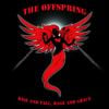
Remove all the "dancers" and this would've been "okay". The quality gap between the reaper and everything else sorrounding it in this awful 2000s CGI is so large, the fact that the unused cover art was exactly like that and they thought "nahh it's 2003, why don't we show our incredible blender talent and we paste in some random body deformed creatures", really what the hell (no pun intended). The first 'Half Life' had better graphics. Okay I know that I said what everyone said already a hundred times, let me at least give it credit for how it fits the music. Just as the cover, could've been good, but there are some unnecessary elements that really shouldn't be there and were just a terrible mistake.
2.
This has to be one of the most boring and meaningless album covers of all time. Somebody really thought "Wow, a hedge, perfect." and that was it, album cover done, ready for pressing. Both fonts for the band's logo and the title look awful as shit. The blue/purple-ish filter just acts as a band aid to prevent the picture from having too many different colors so it doesn't look like a picture that everyone could take in their back yard.
And the child, man. This thing went 3 times Platinum, imagine over 3 million people owning a picture of you as a child being butt-naked. Apart from the fact, that it doesn't add anything to the artwork.
And the child, man. This thing went 3 times Platinum, imagine over 3 million people owning a picture of you as a child being butt-naked. Apart from the fact, that it doesn't add anything to the artwork.


4.
While Korn has a lot of weird and lame album covers, this one in my opinion really takes the cake. There are like 6 different colors mixed into the artwork, colors that really don't complement each other, the contrast between the green, yellow, red and two different shades of blue towards the bottom looks bad. At the same time, why would you use this "two faces/vase" picture and why does it look so awfully rendered, why is it all sorrounded by an olive green frame, even though there is no olive green in the picture... I have so many questions, the color consitancy is so incredibly horrendous and I really can't take this cover serious, especially considering the music and how this was one of the better Korn albums after a looong time.


7.
The cover just makes the albums subjects already feel so on the nose. Way worse than X's artwork when alive, because on here you can really see this was put together by people in suits and ties. Some semi-recognizable font on the title, a yellow/sand-ish filter to make it a bit moodier and the way X has "ugly" written on his face says a lot about the music you're about to hear going into it.

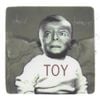
8.
Might be one of the least recognizable covers here. Artist is a YouTuber faking videos in the midst of the "prank" trends and waves, but also did a lot of other videos out of personality for attention, such as trying out music and boy is it horrible. Cover is quite ass too, the pose is awkward and it ties in to the songs about "what if i lose my fame and hype" and all that, as if he didn't suck the algorithms dick whenever possible to achieve what he wanted. Nonetheless, terrible artwork

9.
I respect the idea with a neon sign. Problem is, this is a blink record and seeing their name in a neon sign isn't really what I wanted to see on a cover, it gets WORSE with whatever these colors are in the background. I respect a multiple color concept too, just don't make it look like shit. The gradient going from red to pink looks awful and uncomplementing. The neon sign in contrast makes no sense, like is it floating in this... pool of colors? I think this could by far be more worked around and is just really lazy by playing with this "neon theme/asthetic", so it looks finished.
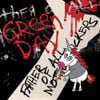
10.
When I had a Green Day phase in 2020, I thought this was like... a compilation or a live album or whatever. Turned out this is a real studio release and looks completely questionable in their discog. Like, the American Idiot hand with the heart grenade, but it's zoomed in more, the writing is bad and ugh the unicorn just takes the cake, goddamn this is awful.

11.
In a way, I still have to give this album cover credit for being so recognizable. I was shocked when I saw the poster of this album in the Scary Movie sequel. That's not to say that it is only recognizable, because it looks so ridicolous and awful. The image with these strange "creatures" looks like the designer needed space for the titles so they just squeezed the image a bit more, which looks absolutely horrible. The font of the titles look like trash, not only that but the gray color of them don't even pair with the artwork and you're just left wondering, what you're even looking at. The "smoke" or whatever that is in the background looks as if the main artwork for this cover was taken out of a book somewhere and the designer didn't edit everything out properly. Yeah, this thing is a mess, though not the worst 'Limp Bizkit' album cover,...

12.
... because that honor belongs to this one right here. Both sonically and definitely artwork-wise absolute miserable work on all fronts. Who gave green light to this cover with this extremely grainy green filter?!... Ironically, seeing Fred Durst scream on the cover says almost nothing about the music you will experience, since it is filled with melodrama and "Oh life is so horrible, Nobody was nice to me in High School, bullies were always putting me down", then simaltaneously talking about fetishizingly creeping behind a girl and comparing his miserable fate to fucking Columbine. You know, like real rock band frontman.
13.
However this album cover became what it is, it apparently went through every design route, as if 10 people worked on it at the same time, each with different ideas. Like in school when you as a group should make a poster and how shitty it looks, when everybody writes their own paragraph onto it in their handwriting.


15.
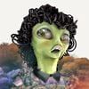
I still remember seeing this for the first time and instantly cringing. I wasn't too fond of 6ix9ine's artwork in this 3D style back then, neither of his music. Just tell me, why is he pissing colors, why is his look so goofy while doing it and why is he doing it in this darkness nothing on a chessboard? I mean granted, it could've been a good metaphor for bringing color into a colorless life, but that sadly isn't the theme of the LP. It is rather... talking about how cool he is i guess? Antifeminism to the edge, but making it look "cool" and "respectable", a little trivialization of drugs too inbetween.
God I never want to meet a fan of his work, I don't even want to imagine their perspective of life. This is everything I needed to see and it is horrible. It makes no sense and I don't like it.
God I never want to meet a fan of his work, I don't even want to imagine their perspective of life. This is everything I needed to see and it is horrible. It makes no sense and I don't like it.

17.
While not being an eye cramp to look at, this is such a lazy and lame album cover. Not only does this help me soak up the masses of Peter Pan Syndrome and corny "You're overworking yourself, everything sucks but we support you" lyrics radiating off of this record, but even for an album trying to have so much fake emotional depth there are way better choices, like this is a REALLY lazy album cover. What is it supposed to say other than just going with the "aesthetic" and playing with "nostalgia", I thought this title is about losing someone? I never understood this record and neither its cover. Even with me adoring a lot this band has done for Nu- and Alt-Metal in its earlier days and being heartbroken having heard of Chesters' suicide. I would also like to think that the band wasn't involved in most of what this album ended up being, I think they were mainly pushed to this.

18.
A... pool. Seen from a rooftop, while it's dark in an urban area. I don't know if I should find this lazy and boring as fuck or if I just don't reach this level of D E P T H.

19.
The photoshop sure is just plain bad but also it tries so hard to get the message across and looks horrendous doing so. I'd add we'll end capitalism the day 5FDP comes out with an album that is actually worth listening.
20.
On some days might be a cool cover and is definitely my favorite of the bunch here in the list, just the sympathy for Ween in general, but something about it kinda icks me sometimes, can't really point out why. And no, it's not the boobs, I love them.


22.
This is probably a placeholder for any 90s/00s cheap metrosexual boygroup photo from times MTV was still breathing air instead of inhaling spray paint and making your coworkers favorite trashy sex fitness resort show. I'll be here if I get recs that are worse or point out what i mean more precise, but this one is already bad enough.

23.
More like no no no. Awful cover, deserves all the hate that it gets. The image is bad enough, but the bands logo is also just slapped onto the picture, could've at least made it 3-dimensional or blocky, but everything here just feels out of place.
24.
This is the standard artwork for everyones local hometown creepy 16 y/o wannabe cloud rapper, thinking that he should choose the edgiest cover imaginable and thinks it looks absolutely c o o l and m a t u r e .
No, it is awful and you are another pubescent teen that tries to hard to impress other local 16 year olds. Nothing more, but maybe even less, because if this is your cover of choice your music is probably the most annoying and basic shit imagineable.
No, it is awful and you are another pubescent teen that tries to hard to impress other local 16 year olds. Nothing more, but maybe even less, because if this is your cover of choice your music is probably the most annoying and basic shit imagineable.

25.
This artpiece is titled "Semen And Blood III".
Yeah, disgusting cover. But MAN, super fucking HARDCORE of them to do that amirite!!
Yeah, disgusting cover. But MAN, super fucking HARDCORE of them to do that amirite!!
26.
Not only is the font and its weird bending shape terrible and the cover as a whole bland as fuck, but the angel or whatever it's supposed to be is off centre. Like, every media editing tool I know has a line to tell you where the middle of the canvas is. And I don't believe that was severe high tech in '08.

27.
I know, as if I was looking for quality in a Papa Roach album.
You can't find nothing at all, if there was nothing there all along.
You can't find nothing at all, if there was nothing there all along.

28.
This is just the worst of the worst. Imagine this was your favorite band (i'm begging you) and "yayy, they drop something new" and THIS is the cover.
Whoever is making media design for Papa Roach should be fired, seriously there's not one of their album covers that isn't absolutely horrendous.
Whoever is making media design for Papa Roach should be fired, seriously there's not one of their album covers that isn't absolutely horrendous.

29.
This looks like the japanese horror film DVDs in the restricted area at the video store.

30.
Again neon style, and then that horrible wave, the way the title is spaced makes me scream too. What a waste of purple, that is already such a great color on its own.


32.
Hooray for a couple hilarious stock image lightning bolts. Doesn't make the homage feel less authentic at all, nahh

33.
Are you expecting me to ask who he is and why he's on your cover, like whatever but my autistic ass is screaming when i see the crop job on this. You can have a jewelcase as your cover, sure but who tf crops that shit onto a 1:1 format? AHHHHHH god this is so terrible, and the color from the spine isn't even fitting the picture, what WAS THE NEED

34.
I guess it tries to be somewhat kinky? Idk, Madonna always had weird covers, but this one really doesn't make sense to me
35.
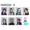
To say anything positive, this actually reflects Maroon 5's fanbase very well, from my own experiences

36.
"Yeah no, really just clusterfuck anything onto the cover if you can somewhat interpret political meaning into it."
Not even centrists are politically insulted by this.
Not even centrists are politically insulted by this.


6
Comments
Sign in to comment

Sickbeet
1y
Chocolate and Cheese has a great cover though!!!

magnoliia
1y
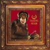
‘Ye’ doesn't even have a bad cover

L4ZER
1y
Nuthin 2 prove cover goes hard bro what do you mean 😭

Mantaxania
1y
@L4ZER that pose and the lighting though, idk. But yeah goes hard, I removed it 😭

Marisa Kirisame
9mo
why is change here i love that cover
ToTheEdge
1mo
I mean absolutely no offense when I say this, but some of these takes reek of having your head up your ass


